Best Ecommerce Sites
50+ Inspirational eCommerce Site Designs To Transform Your Business
SaleSource Team


50+ Inspirational eCommerce Site Designs To Transform Your Business
The whole world is going digital. We’ve known this for quite a while now and current events keep reminding us that this really is the case and will continue to be the case for the foreseeable future.
For those who aren’t yet online, the time is now. For those who already have some presence, the name of the game is keeping up and growing. Nothing’s easy in e-commerce, only worthwhile if done right.

Getting an e-commerce website up and running could be quite daunting and nerve-racking. The same could be true for an existing website that needs some sprucing up to keep up with technology, trends, and competition.
There are just so many factors to deal with such as budget, conversion optimization, proper project management, etc.
Inspiration is key during the planning stages so to help you out, we’ve gathered 49 quite successful e-commerce websites you could learn from.
Elements of Successful E-commerce Website Design
If you want a truly lucrative online business that's killing it in sales, you'll need a website that’s trusted, legitimate, and presenting your products as absolutely essential.
Here are a few must-haves for e-commerce website design:
- Clean design. According to an article on WebFX discussing critical website design statistics for 2020, 75% of online business credibility comes from how a site is designed. Staying minimalistic and making sure there are no unnecessary elements allows your users to gravitate towards what matters--the value of your products.
- Straightforward navigation. The web in general has tons of distractions. Make sure that when your customers land on your site, you guide them to what they might be looking for. Ultimately, guide them toward your products and from there, the checkout page.
- High quality and high-resolution product images. Unlike physical stores, customers can’t actually interact with your products. The best way to make up for this is by providing as many photo details as possible.
- Detailed product descriptions. The most advanced e-commerce websites use text to optimize for search. However, make sure your product descriptions are detailed and useful also for your target audience.
- Painless checkout process. Adding stuff into their carts and ultimately checking their items out must be as painless as possible. The last thing you want is for them to change their minds midway to their purchase.
- Built for every device, especially mobile. 2 out of every 3 minutes users spend online are from mobile devices. Have a website that’s built for where your targets are.
Ultimately, it’s functionality and aesthetics that sum up e-commerce website design essentials. How should you build the structure of the website? Where can I get beautiful design inspiration that has already been validated, getting rid of guesswork?
We tackle both in this article. Let’s start with the best website builders and platforms available.
Best Website Builders and Platforms for eCommerce
Your options for e-commerce website builders and platforms abound. And whatever strategy you have in place and whatever design you have planned, where you implement and operate your website matters substantially.
While no one’s stopping you from building your website on practically any platform, there are, in fact, proven and established e-commerce website services out there.
Why is this important?
E-commerce operations require different functionalities and features. Although Wix and Squarespace are great for basic websites, they’re not quite the best builders for selling products.
When choosing a platform or builder, make sure that e-commerce is its main thing and not just an afterthought.
Below we list your best options for building your e-commerce website:
Shopify

Easily the most popular e-commerce builder in the market today and has been for years. Perhaps the most successful e-commerce sites use Shopify.
It’s actually built for e-commerce, unlike other basic website builders that simply added an e-commerce function.
And because of its popularity, there are thousands of apps, plugins, and integrations available to Shopify users. These add-ons make it a lot more powerful and provide quite that support for users with changing and differing needs.
Shopify users are also treated with dedicated customer support, live people they can talk to 24/7.
The monthly fee of $29 to get started could be hefty for new players, but once you’re up and running, and if you’ve mapped out your launch correctly, the service basically pays for itself.
Advanced users have higher tier options, too, all the way to $299 per month and custom options for really big players that start at $2,000 per month.
Overall, Shopify is very easy to use and anyone can get started with it, with or without an actual designer and developer in your team.
Woocommerce

Woocommerce requires a bit more technical knowledge to implement compared to Shopify but at the most basic, it’s free.
Well, sort of free.
Woocommerce isn’t its own platform and must be installed on CMS like Wordpress which in turn must be running on a hosting platform.
Now because Woocommerce presents itself as free, it’s the most popular builder when it comes to number of users. This huge amount of users also means quite a substantial amount of community support online. This is perhaps its biggest selling point along with a huge number of plugins and integrations already developed.
Wix and Squarespace

We had mentioned above that Wix and Squarespace might not be the best options for selling products online because e-commerce isn’t their main function, i.e. e-commerce is merely an afterthought, an additional feature.
However, there are a few reasons you might still want to consider initially building on these platforms.
It’s not Price because they’re practically the same monthly fee as Shopify to get started. But if you want to be doing everything yourself, or you’re selling only one or two items or item types, the ease of use might be a selling point.
Think small e-commerce activities, i.e. selling stuff online is only a small part of your whole web operations. Maybe you’re a gaming or beauty influencer wanting to sell merch online? Or perhaps you’re a musician wanting to sell self-published CDs?
Bigcommerce

Bigcommerce is quite similar to Shopify and used to be very competitive back in the day. Shopify has since left Bigcommerce in the dust having advanced in features over time but e-commerce brands still use it.
Its most popular feature is the actual website page builder which can be boosted with a drag and drop plugin make it very easy to use and manipulate.
But then it doesn’t quite make sense to grow using this platform because pricing doesn’t seem to work in their users’ favor. That is, the more you sell, the more you pay.
At the end of the day, Shopify is the better option when compared to Bigcommerce.
Amazon and eBay plus other marketplaces

Don’t need much functionality and simply would like to get started selling? There’s Amazon and eBay to get the ball rolling for you.
Maybe you do want your own website later on but would like to validate some ideas and products first?
Simply create an account, upload your products, and voila, you’re selling.
One caveat is, you don’t necessarily own the customers and don’t get to easily re-sell to them or nurture them for upsells and such in the future.
But hey, after all the data gathering and validation, you can then move your e-commerce operations over to Shopify or other platforms quite easily.
Drive Entrepreneurial Growth in 2020 with Inspiration from these Top E-commerce Website Designs
Okay, so now you know more or less which builder or platform you’ll be using. But the question remains: how do you want your e-commerce website design to look? How will you be able to guide your would-be customers through the buying process? What’s the best way to present your products and product types?
Here’s some inspiration to get you started on the right path:
Best Style, Fashion, and Lifestyle E-commerce Website Designs
Rifle Paper Co.

Rifle Paper Co. sells planners, calendars, home decor, as well as party supplies.
Apart from navigation at the top, there’s an option to filter and sort even further from the left panel on their store.
Each wallpaper product page is complete with color options, full descriptions, even more images of the product, and suggestions of what other listings might interest the customer.
YourLibaas
YourLibaas is an Indian fashion e-commerce company headquartered in Dubai, UAE with domestic head office in New Delhi. It was founded in 2014 by Khalid Raza Khan to sell ethnic wear. YourLibaas sells salwar kameez suits and kurtis among other fashion apparel. They have a strong social media presence with over 260k followers on Facebook & Instagram.Hardgraft

Hardgraft sells shoes, bags, and other accessories made with premium leather and wool.
The design is very clean and navigation is on-point. When you hover on a product, there are options right away. Customers can choose size, color, or go ahead and purchase.
When you click through, you are treated to additional stunning images of the product, all hi-resolution. In addition, full descriptions and shipping information.
Gentle Monster

Gentle Monster is in the business of sunglasses, plain glasses, and other accessories. A big plus in this e-commerce website design are the excellent images of models using their eyewear.
Scrolling through their products is quite uncomplicated and you get to see more pictures, thorough product descriptions among other neat features.
BioLite

BioLite creates and sells self-reliant energy solutions that harness what’s available in surrounding areas. The navigation on the website makes it very easy and effortless for their visitors to go through what offerings they have and also learn the value they bring to their customers and the communities they serve.
AllBirds
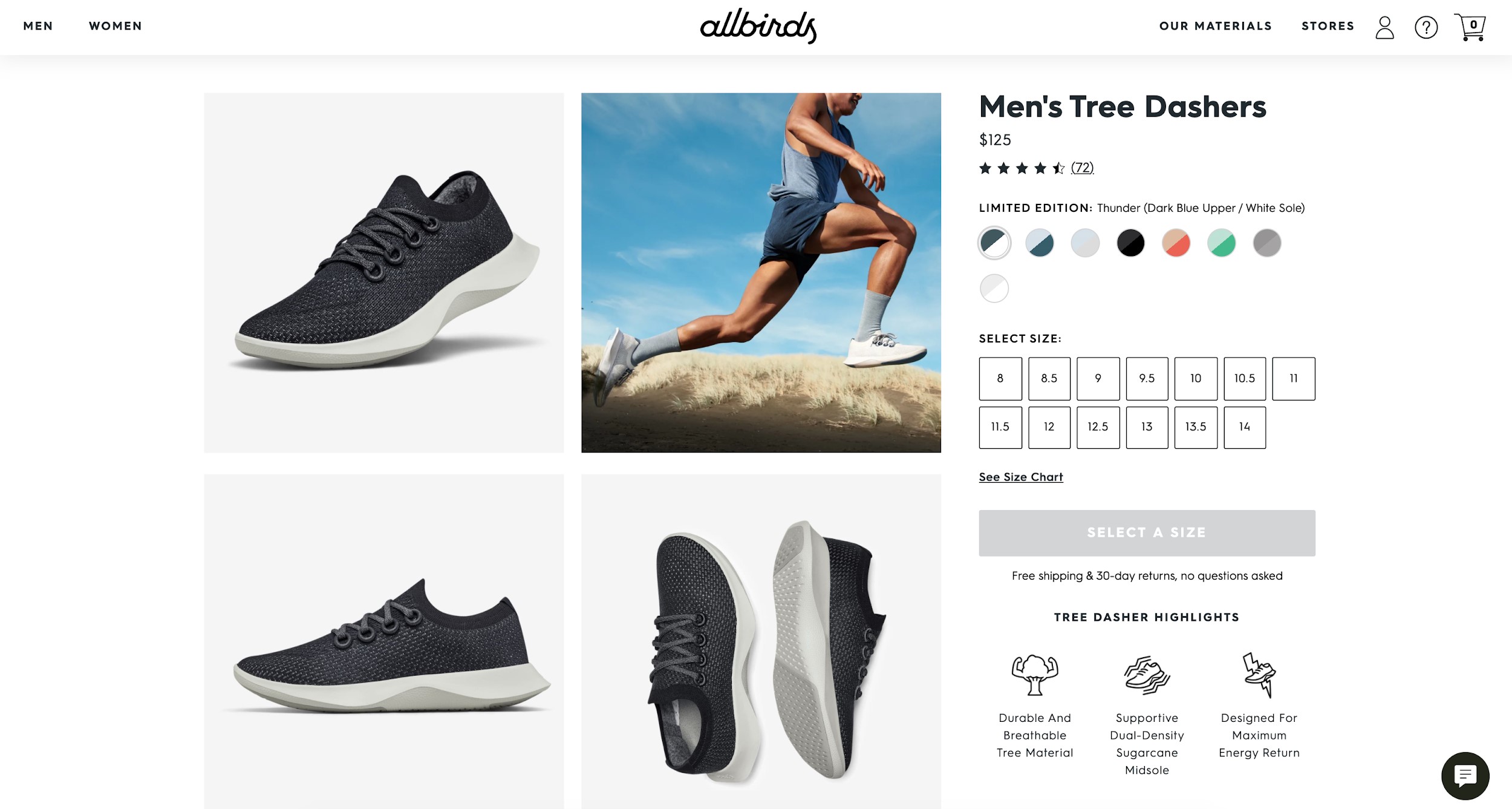
Really high-quality photos and action shots, not just shoes on a page but showing their shoes in action and actually being used by humans. This alone sets AllBirds apart from other e-commerce sites selling similar products. But there are quite a few more excellent design elements at play especially when customers browse through products.
Studio Neat

Studio Neat prides itself on creating and selling simple products that solve real-life problems. The website design is super clean and every part of their e-commerce presence has a call-to-action leading visitors to something of value, something they might actually care for.
Product pages expand with tons of additional product descriptions, benefits, and images.
Frank Body

Frank Body’s website design reflects perhaps the main message behind their product line--modern beauty that’s young, fun, and without unnecessary complications. All throughout the website, the copy is authentic, witty, and really talks to its audience.
Quite effortless to fall in love with their products and “adding to bag” all the way to check-out is a cakewalk.
Norwegian Rain
Norwegian Rain is a fashion label originally from Bergen, Norway and has since opened physical stores in Paris, London, and Tokyo.
Their products are structural, quirky, and bold. And customer’s see these all throughout the website. Their products are all on models that wear them well giving customers an idea how they will look on them.
Novo Watch

Novo Watch sells beautiful timepieces “resurrected” from historic pieces. All products are handcrafted, hand-engraved, hand sourced, from Canada.
Each product page conveys luxury and beauty because of all the well selected images. It doesn’t lack in product description, too, as they include design information, product story, and additional details for each watch.
Best Mom, Family, and Kids' E-commerce Website Designs
These little bundles of joy trigger, too, the joy of shopping online. Selling to moms and dads who need clothes, toys, and gear for their kids and families proves to be quite the profitable enterprise. It’s also a huge source of creativity among online retailers with successful e-commerce websites.
Check out some of our favorites below:
WildBird

WildBird caters to moms and dads who want to keep their baby and toddlers close as they move about their day. The images on their website shows their products actually being used, mostly by moms but also by dads, all smiling.

Their product pages are also full of pictures from past customers who’ve posted on their socials how happy they are with their purchase.

Madsen Cycles

Off the bat, it’s fun with the whole family at the Madsen Bikes website. You’re also invited to “Pick a Color.” And when you do, you get to a collection of bikes you might just want to purchase in bulk!
Customers are treated to additional options in each product page complete with popular added accessories such as front racks, rear lights, and more.
RedsBaby

An Australian e-commerce company, RedsBaby sells baby strollers on their simple and clean website. High-quality pictures all around, not only of just their products but of their products being used by parents.
In their product pages, customers get to choose color and type among a few other options plus get to read full product descriptions, features, and reviews.
Feltman Brothers

Feltman Brothers has been in the business of selling hand-embroidered babies’ and kids’ clothing since 1916. Yes, 1916! So they obviously didn’t start out online but they are quite making headway in e-commerce.
Website navigation is quite intuitive and everywhere you turn, there’s beautiful pictures of their products being used.
See Kai Run

See Kai Run sells shoes for kids and their product pages offer sizing guides among other neat features. The whole site is rich with images of kids and moms appearing to really enjoy their products.
Navigation is pretty straightforward and the add to cart to check-out process does not require too much effort.
Bellota Baby

Purees, baby bites, and natural nectar! It’s all yum for baby at the Bellota Baby website. Of note on their pages is a blog that features recipes and nutritional tips for parents. Product popups are complete with descriptions, additional images, and nutritional information. Clicking on more information takes customers to full product pages with complete descriptions on a very clean page.
FidgetLand

FidgetLand’s website design is clean and visually appealing. The product pages are straightforward, highlighting their products and giving options that are very easy to choose and navigate through.
Selecting a product, adding to cart, and proceeding to check-out takes all of three clicks so that’s a real win in guiding customers through the purchase journey.
Nature's One

Nature’s One sells organic formulas, drinks, and other products for babies on such a friendly and informative website. Their choice of colors is very appealing and it extends to each and every page on the site. Upsells in their product pages, the option for higher can sizes and pack sizes, can be seen as quite seamless and thereby effective.
The Dairy Fairy

The Dairy Fairy website sells nursing and pumping bras and also lactation foods among others. They have done a great job of using images to show would-be customers what the products would look like when used. Product descriptions, shipping information, structured bra size guidelines are only a few of the features implemented on their product pages.
Best Arts & Crafts and Interior Design E-commerce Website Designs
If you’re selling art, craft products, or interior design related products online, it goes without saying that your site must be well designed to be credible and worthy of a purchase. Another key? Images, images, images. Lots of them and at the highest quality!
Here are a few examples of websites winning in these industries and niches:
Amira Rahim

Amira Rahim teaches art and creativity. She also sells her artworks on such an aesthetically pleasing website. Her pages also feature rave reviews from previous customers making it a bit less complicated for would-be customers to make decisions.
The artwork images also show the products in actual living spaces which helps customers visualize better.

Thing Industries

Quite a favorite among designers, Thing Industries features a website that’s fun, young, and very painless to navigate. The shop itself sells witty products you just have to have somehow what with their witty and convincing product descriptions. The images don’t hurt too as they are truly well planned and implemented.
Wrightwood Furniture

If you’re in the market for furniture, it’ll be hard to ignore the collections featured on the Wrightwood Furniture website. Their lines range from high-end to affordable, massive to compact. They have a lot of offerings but customers won’t ever have trouble because navigation and website user experience have been designed quite well.
Haus

All the way from East London, Haus sells cautiously selected contemporary furniture, lighting, and home accessories that scream quality, beauty, and quite polished! Their product pages are very clean, complete with information and product images that help through the customer’s purchase journey. Adding to basket and checking out are truly uncomplicated.
Emily Jeffords

Emily Jeffords is an abstract impressionist painter who also teaches art and creativity. On her main website, she sells prints, notecards, and calendars.
Every page and section you land on, there’s just beauty and art all around. You’ll never get tired going through product pages which have tons of appealing images and also complete with item descriptions.
Hauser

Hauser prides itself on creating beautiful, hand-crafted, outdoor and indoor functional furniture from Canada.
As a website, it features a massive collection without overwhelming the visitor. Customers head on to product pages for an ample amount of images, product details, shipping information, and reviews.
They also offer an interactive tool called the Space Planner used to customize personal spaces with furniture in their line.
Pop Chart

Pop Chart sells prints and scratch-offs. Their product pages allow for finishing options and the whole site itself is fun, clean, and extremely trouble-free to navigate. Font choice is on-point and the colors they employ make the whole experience, from viewing products to adding to cart to checking out, easy to the eyes.
Kelly Rae Roberts

The Kelly Rae Roberts website is as visually appealing as it can get. And the shop itself conveys all the artistic sensibilities you would like to own or give away to family and friends..
Kelly sells stickers, cards, manifestos, and journals among others. Her product pages are full of color and beauty. Apart from images and product descriptions, she also offers suggestions on what other listings to check out.

BoxHill

The design of the BoxHill website is very neat and clean indeed. The quality of their images conveys their central goal as a company which is to “Help others realize their ideal outdoor vision through high-quality furnishings, smart design, and impeccably curated style.”
BoxHill sells outdoor furniture, outdoor lighting, tables, among other furniture must-haves.
Navigation is simple and straightforward leading to products that are presented without unnecessary elements and yet complete with all the information one might need in order to purchase.
Best Sports & Fitness E-commerce Website Designs
Growth in fitness and sports e-commerce doesn’t seem to have any end. Each and every sporting event and fitness expo seem to have double the number of attendees as the last. And social media pages are always full of people engaging in sports and fitness activities, not only from brands but more so from actual customers.
Despite the huge market, competition is high and this is why designing websites that can compete to sell is paramount.
Here are our favorite sports and fitness e-commerce website designs:
GymShark

GymShark, based off of the United Kingdom but making waves across the globe, is a leader in fitness and sports apparel e-commerce. They are a manufacturer and online retailer also making their presence felt quite a bit in social media.
Their product pages are filled with the highest quality images of models wearing their wares. Product descriptions, size guides, and color options lead customer through the purchase process.
Xenith

Founded by former Harvard quarterback and Columbia University MD Vin Ferrara, Xenith sells American Football helmets, shoulder pads, accessories, and more. Their product pages allow for customization with various options such as color and size. Product descriptions cover actual item details plus technology, customer reviews, and more. Clearly built by an athlete for athletes.
Brilliant Bikes

The product pages at the Brilliant Bikes website offer very detailed specs covering size, speed information, and technical specifications. And it’s not all text as they have taken the time to design accompanying visuals to make it a whole lot easier for customers to make that buy decision. Product images are also as high quality as they can get.
Quad Lock

Quad Lock employs video and high-quality images on their sales pages to bring customers as close to their products as possible. Each product pages also has descriptions, what’s included if purchased, and technical specs. Navigation throughout the whole website is painless and customers are shown product review from previous buyers at very strategic locations.
Almond Surfboards

Almond Surfboards sells surfboards, wetsuits, t-shirts, accessories, and even wall art. Huge plus all around the site are the product action shots as well as beautiful, well-photographed images of their products. Their product pages don’t lack much as they are filled with descriptions, images, technical specs, and previous buyers’ reviews.
Ride the Tide

Ride the Tide sells stand-up paddle boards, paddles, and accessories from their main base in Queensland, Australia. They take you very close to the water, feeling the paddle with their website images. Navigation is a breeze, too, and each product page is complete with all the information customers might need.
Training Mask

Training Mask sells a product that claims to improve respiratory compensation threshold. And since they’re targeting professional athletes or regular folks who are very serious about their training and fitness, they have done an extremely good job in employing images of people training while actually wearing their masks.
Their product pages make it easy for customers to select based on size and style and also read through features, descriptions, and customer reviews.
Best Food-Related E-commerce Website Designs
Food-related websites comprise the single biggest umbrella group in e-commerce but it is noticeable that some stand out quite a bit more than others.
To achieve this, having the best website design, compelling calls to action, and navigation that’s easy and leads their journey through product awareness all the way to check-out, are key to growth.
Check out these food websites that are doing it right:
Abel & Cole

Abel & Cole is a UK based online grocery that sells, among other things, organic fruits, vegetables as well as meat and fish.
Category and product pages are filled with high resolution images as well as detailed descriptions making it virtually effortless for customers to fill their baskets and eventually check out.
Ben & Jerry's

Ben & Jerry’s sells their popular artisan flavors on their website, full of images that make you go “Yum!” It might seem that they didn’t need to put in much effort into their site because of how popular they are to begin with. But the fact of the matter is, each design element on the site has been well planned and implemented making if easy for customers to move from initial landing to ordering their delicious pints.
49th Parallel Coffee Roasters

49th Parallel is an e-commerce website that sells coffee products such as beans, coffee accessories, and even merch. The website also provides a lot of valuable information for customers like brewing instructions and more!

The product pages are complete with full information about their wares and even videos here and there.
Archie Rose Distilling Co.

Archie Rose Distilling Co. is a distillery and bar working out of New South Wales in Australia. On their website, they sell their own collections of gin, whisky, vodka, as well as other limited releases.

Their product packaging itself is well designed and they have done a truly awesome job exhibiting this fact all throughout the website.
Their product pages educate and guide customers about their offerings and before they know it, they’re checking out to become proud owners of these excellent products.
Nutriseed

Nutriseed from the UK sells healthy and natural products that promote wellbeing, diet, and weight loss. Navigation is obviously well thought out and the way the design elements have been laid out is quite cutting edge and professional.

It’s easy for customers to land on their product pages and when they do they get virtually everything they need to know on one cleanpage. All they need to do at this point is “add to basket” and check out.
Grow & Behold

Grow & Behold is in the business of selling sausages and other delectable meat products. The images of raw items project freshness while the images of cooked sausages make you want to bite right through.
Customers are able to navigate through this virtual meat grocer a lot better than in physical stores and any question they might have would have been answered in the product pages.
Kettle & Fire

Kettle & Fire sells Keto broths, bone broths, soups and Keto soups. Unique in a sense but definitely not out of reach what with their very enticing product images.
Once customers landon their product pages, all questions are answered and options given so that the only thing one is left to do is click on several items and head on to check-out.
TesseMae's

TesseMae’s, an e-commerce seller of dressings, condiments, marinades among others, shows you all your options on their website and makes you want to buy them all!

Awesome navigation across huge collections but you don’t feel any noise. Check out the condiments section and navigate towards each product where you’ll see full product descriptions, certifications, and product reviews.
Harris Farm Markets

Harris Farm Markets is another grocery-type e-commerce website that has got it in the bag in terms of website design. Based off of Australia, they sell fresh fruits and vegetables and meat among other usual grocery items.
Navigation is well planned and has been categorized neatly. Getting from product selection to cart filling and ultimately to check out isn’t an issue at all.
Best Nutraceuticals E-commerce Website Designs
The market for health-conscious and fitness products and services keeps growing year on year. You don’t have to look far online to see healthy food and tips for better health.
Now although you might be eating whole foods, keeping close watch of your intake, you might still not be getting enough. Especially if you’re living quite an active lifestyle or even just because of the stress of work, you need even more nutrients in your body.
Enter Nutraceuticals online. Lots to choose from but only a few truly delivering trust and quality to their clients.
Here are some companies doing it right in nutraceuticals and supplements e-commerce.
310 Nutrition

With over half a million likes on Facebook and over 200k on Instagram, 310 Nutrition is doing something right and their community is happy and thriving.
310 Nutrition sells products for health, weight management, and nutritional supplementation. Because of the images on their website, they all seem like decadent dessert to the eyes.
TruBrain

TruBrain sells "brain food" with products ranging from drinks, bars, capsules, and coffee. Simple and clean design with lots of images that aid customer decision making for sure. Products and product pages aren’t lacking beautiful colors, too.
The site has loads of information about the science behind their products. Their get started page is perfect for new customers.
The Vitamin Shoppe

The Vitamin Shoppe has shops across the US but also sells online. And the way they designed their site shows they are not only credible offline but very trustworthy, too, as an online seller.

Products come with very descriptive titles and details as well as well photographed images to guide would-be purchasers.
eVitamins

eVitamins sells vitamins and supplements as well as bath and body products and some grocery items. The e-commerce website itself acts as an online grocery store where navigation is based on item categories. Seems a lot at first glance but gets the job done and customers don’t get easily lost.
1Up Nutrition

1Up Nutrition utilizes influencer and model images, powerful colors, and enticing product descriptions to sell supplements, apparel, and more on their e-commerce website.
The shop features stacks for fat loss and muscle building among others making it straightforward serious athletes and fitness aficionados to grab by bulk. However, customers who might want single products for very specific needs won’t have a hard time either with the ease of navigation on the site.
Care/of

Care/of takes nutraceuticals e-commerce to a whole new level of beauty and art. Their support images are of the highest quality and product images and descriptions show you true value. Their choice of font and colors, overall branding in general, tell you one thing--their designer did not build this overnight.

Conclusion
If you’ve actually gone through just even some of the website design inspiration we presented above, you’ll see that there’s one thing in common among them. It’s that they didn’t skimp on creating wonderful websites for their visitors and potential customers.
The owners and designers were fully aware that what might make them successful isn’t only that they can sell products but that they can sell the value behind their products. These brands ultimately sell the idea that they deserve to be part of the lives of their customers. And they did it quite well by utilizing everything available to them in terms of designing and building their e-commerce presence.